Gubagoo Dashboard
Increased feature adoption of Gubagoo's dashboard by 53% by giving dealers actionable insights and clear ROI from their digital sales data
Background
Car dealers rely on reporting to make strategic business decisions
Gubagoo’s dashboard allows users to evaluate the performance of their many sales tools. Dealers rely on accurate reporting to gain insights, pursue effective channels, and gauge the ROI of Gubagoo's services. It’s the main factor they consider when deciding whether to continue service or to cancel.
The problem
The current dashboard was leaving them confused and distrusting of our data.
- Users didn't trust the accuracy of data
- They felt that it wasn't organized in a meaningful way
- Labels and naming were unclear
We also discovered users were creating workarounds—exporting data and running their own analysis.
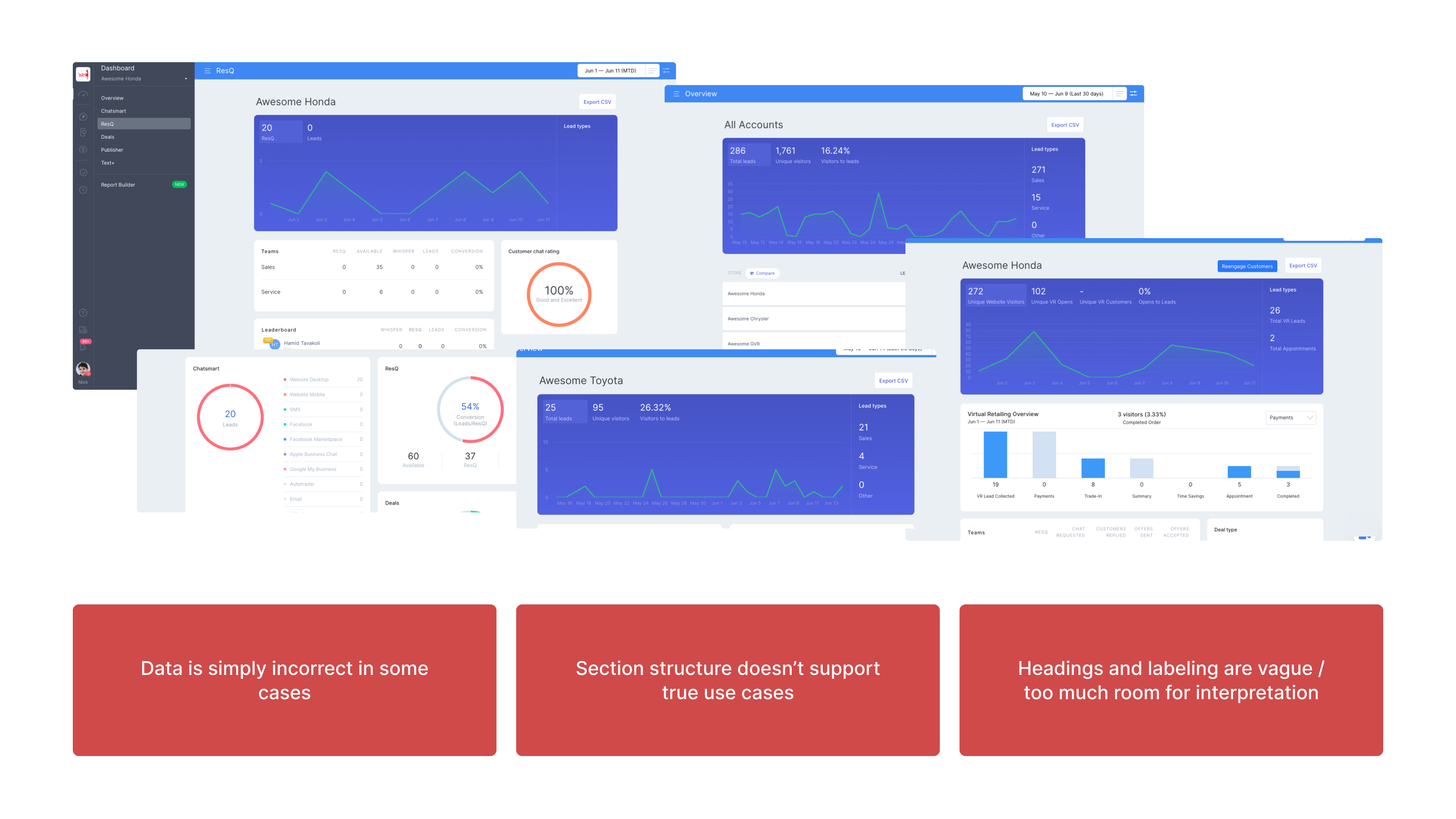
We needed to help dealership staff gain meaningful, actionable insights from their data.
Further dealer and CSM interviews uncovered four main needs that the dashboard needed address:
- ROI of Gubagoo as a whole
- Gain insights to optimize strategy
- How my staff is performing
- How I can make changes to improve my ROI
Improving data integrity
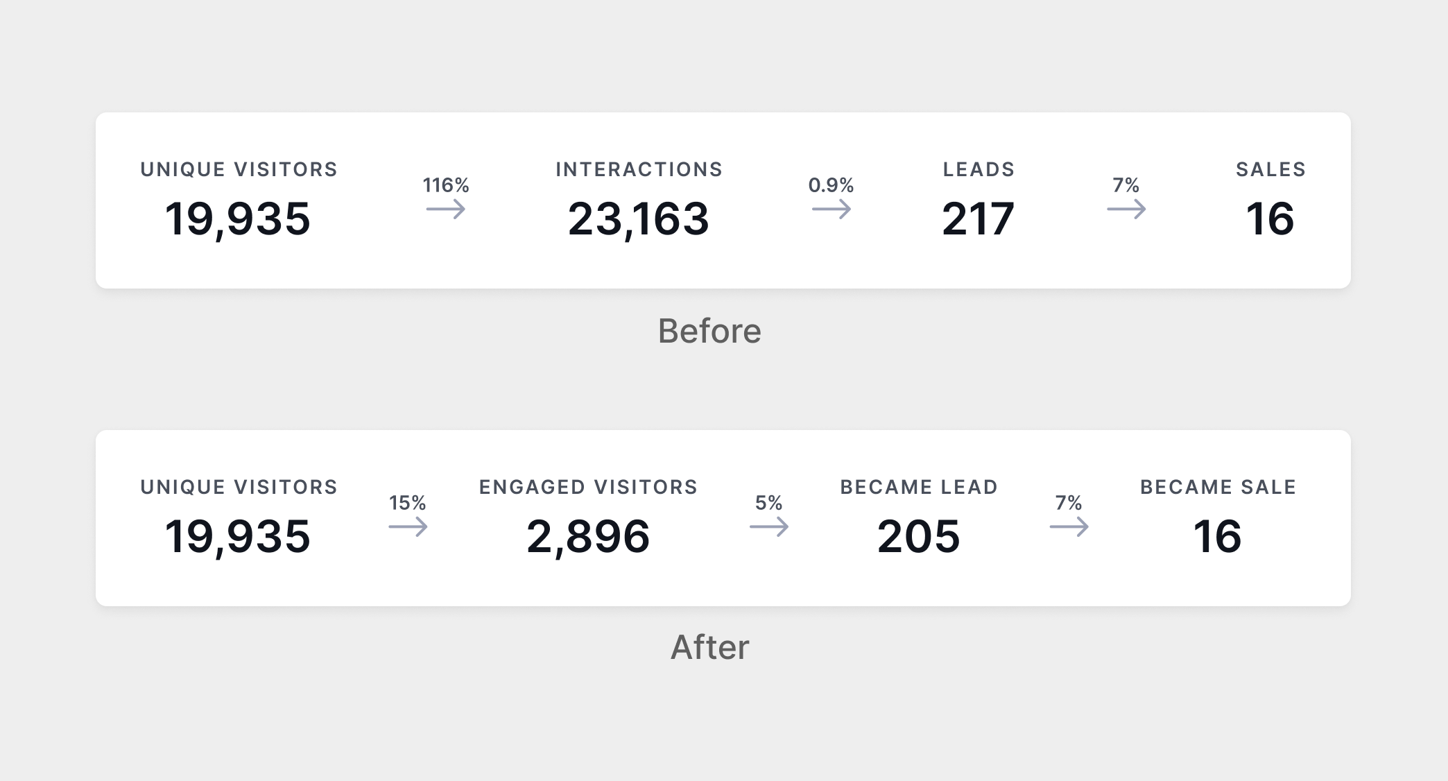
The current method calculating interactions was technically accurate, but deceptive.
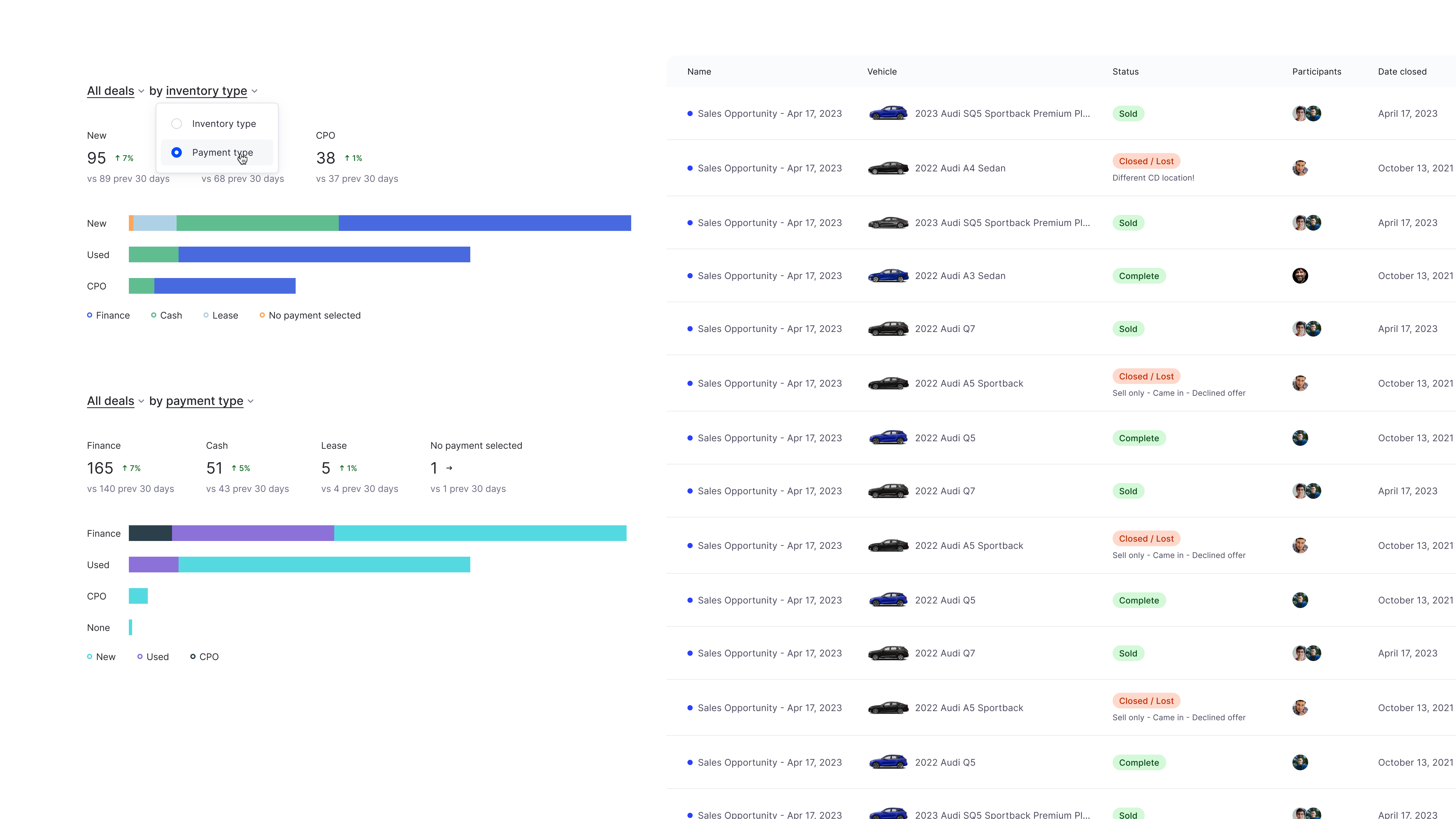
What dealers really cared about was how likely a unique customer is to convert via a specific source. In most cases they wanted to see a true conversion funnel, not the total number of interaction instances.
After discussing with the team, we agreed to adopt a unique engagement model as a default, creating a more true conversion funnel.
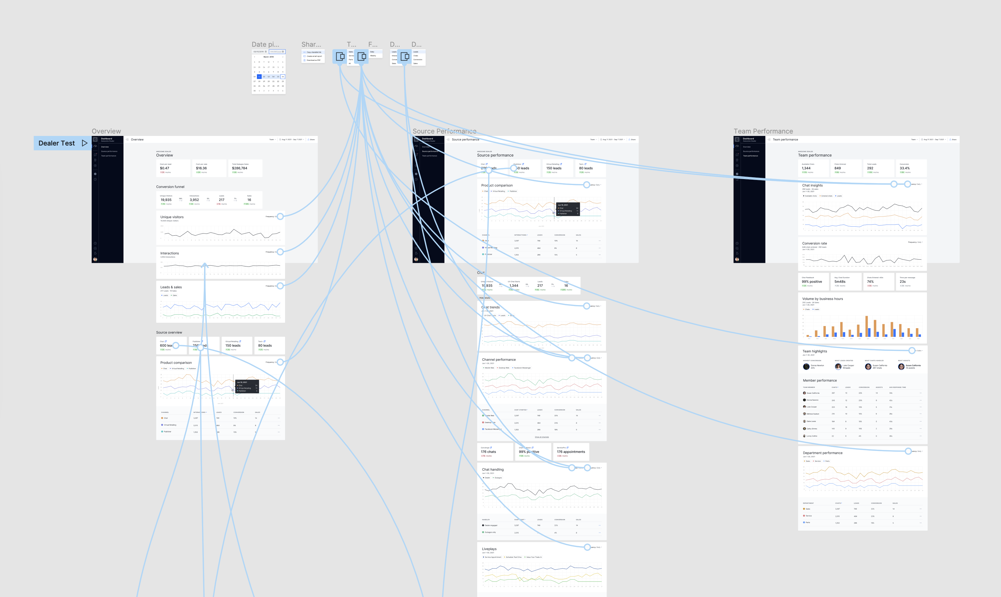
Purposeful sections and intuitive labeling
With our user goals as a guide, I drafted new sections, grouping data logically to support real use cases. I also revised all subsection and label naming to improve clarity.
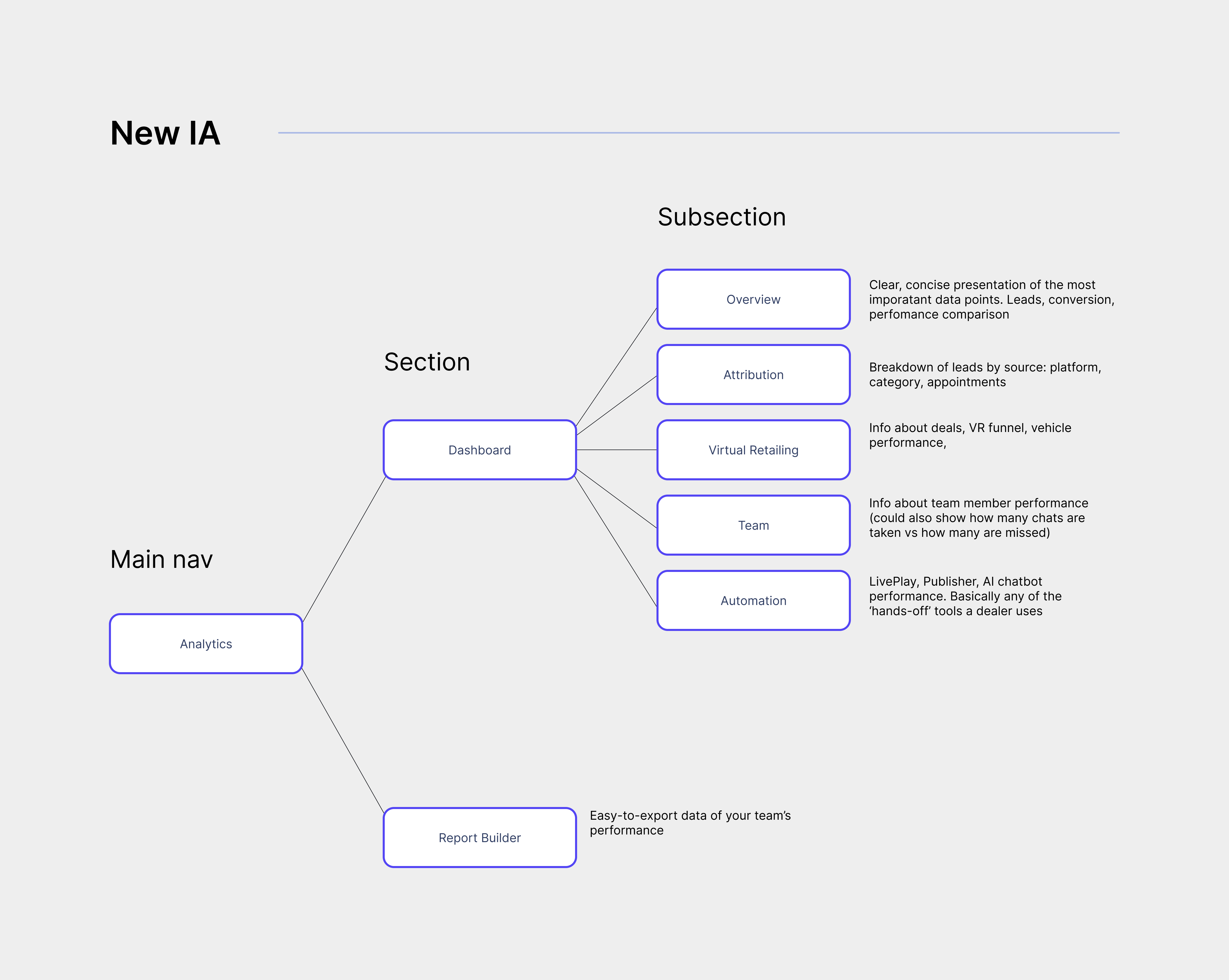
Which after some revisions, landed here—each section built to support a user goal:
- Overview - high level performance / ROI
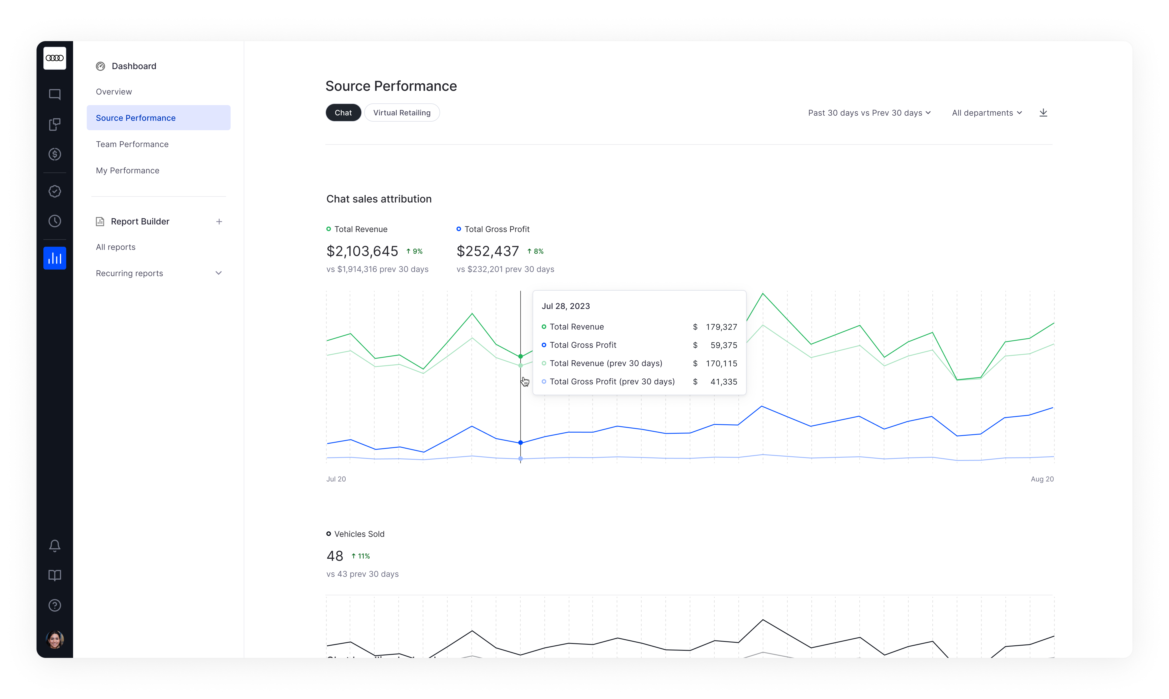
- Source Performance - compare sources and channels
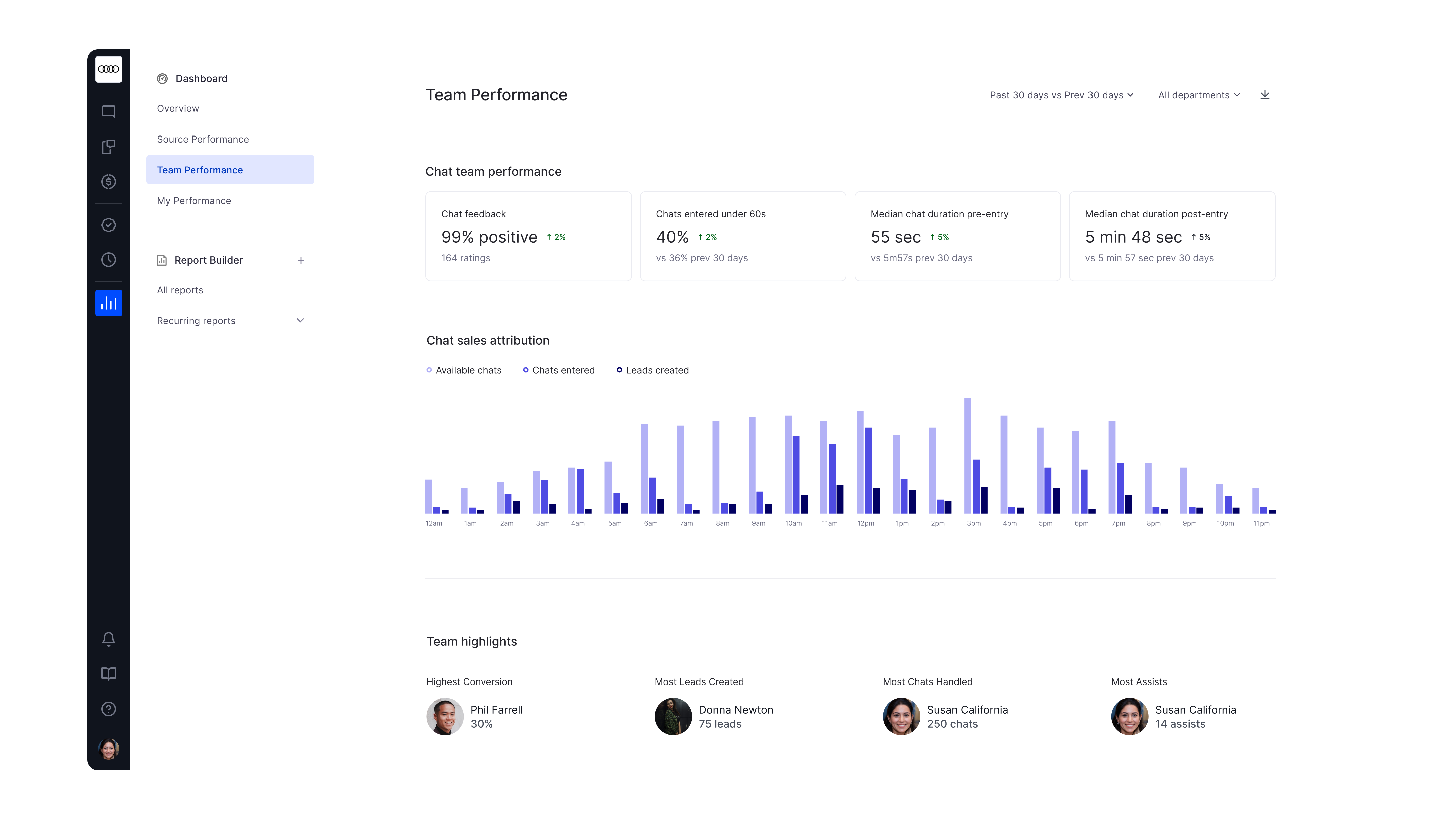
- Team performance - how is my team performing?
- My Performance - how am I doing?
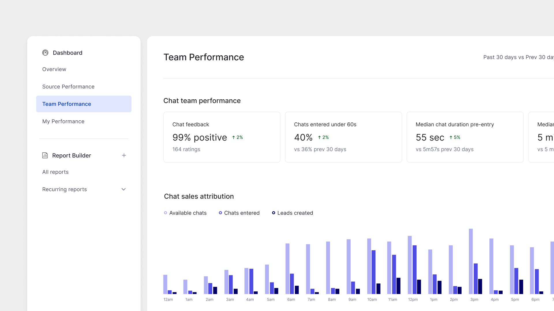
Clear charting
I wanted to ensure that users had honest representations of their data. Because this was the most in-depth I’ve gone with data-visualization, I took some time to read up on charting.
I opted to use primarily simple line charts for time-series data, and bar charts for volume comparison for their easy interpretation. Hover menus and accompanying tables provide additional context as needed.
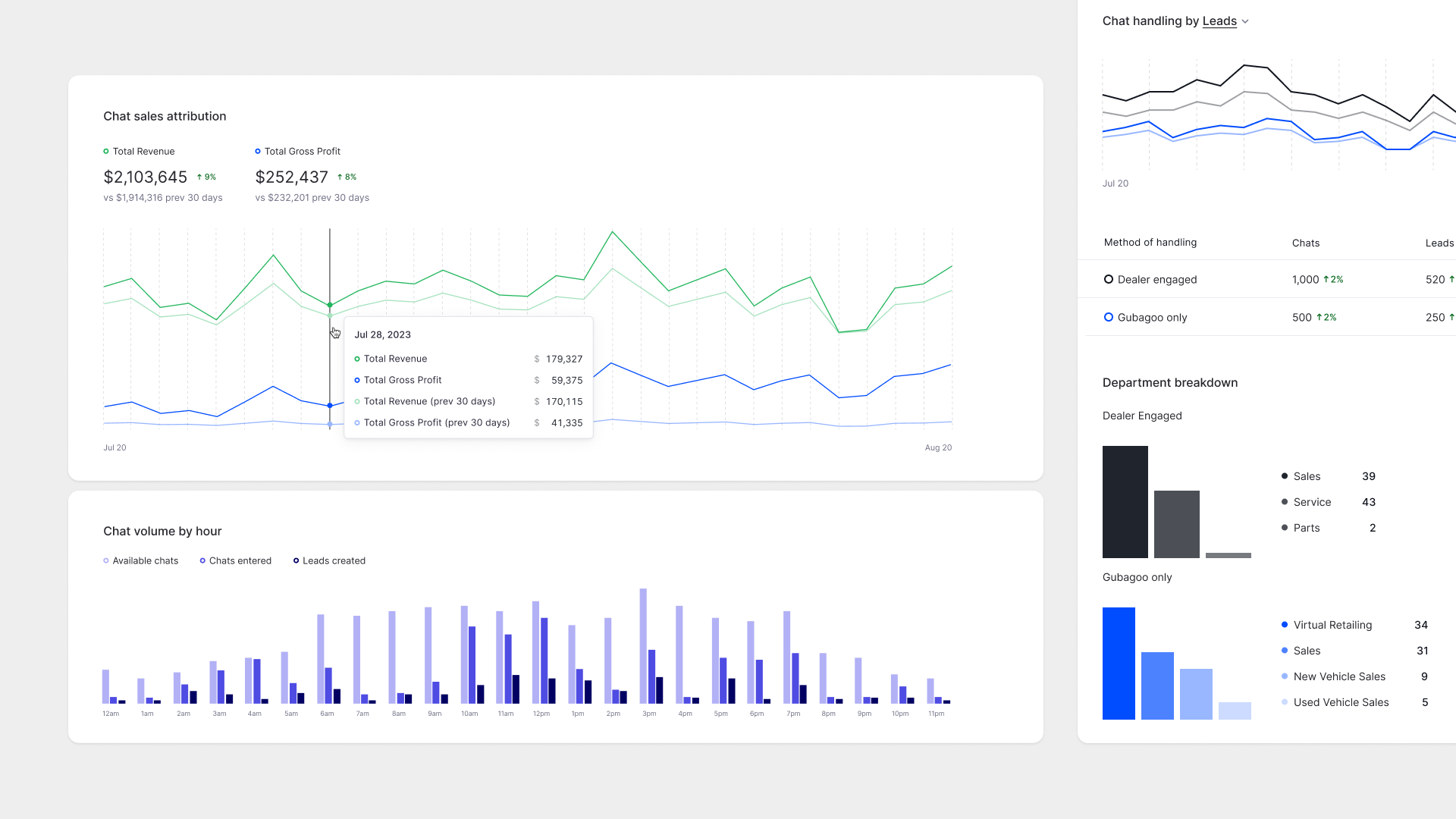
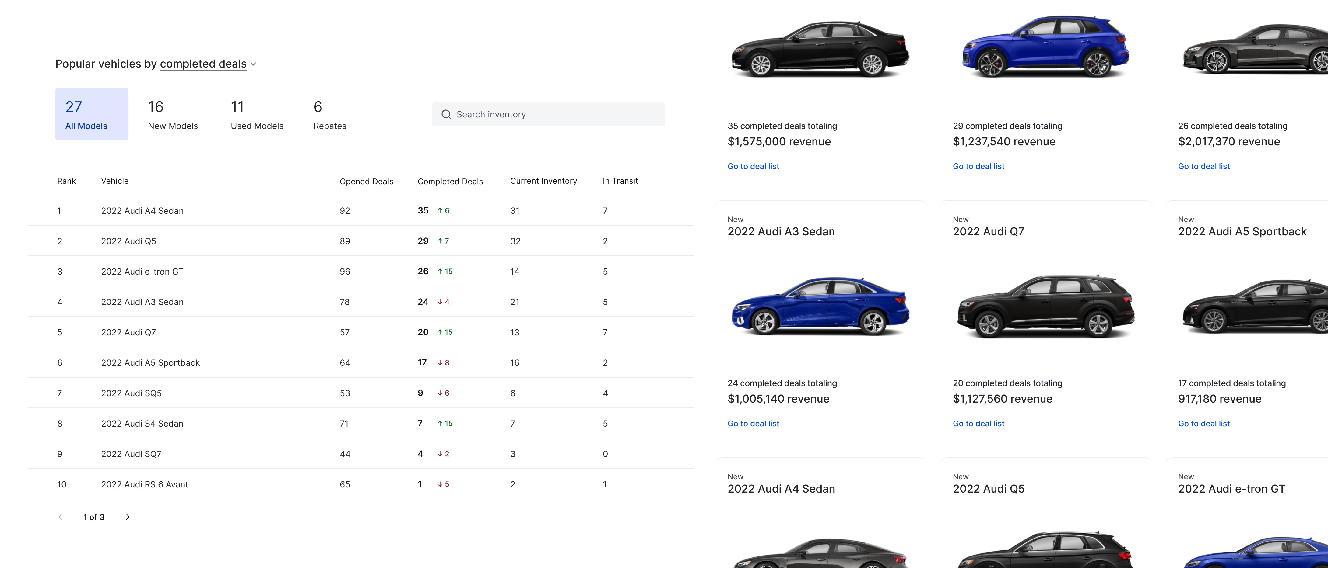
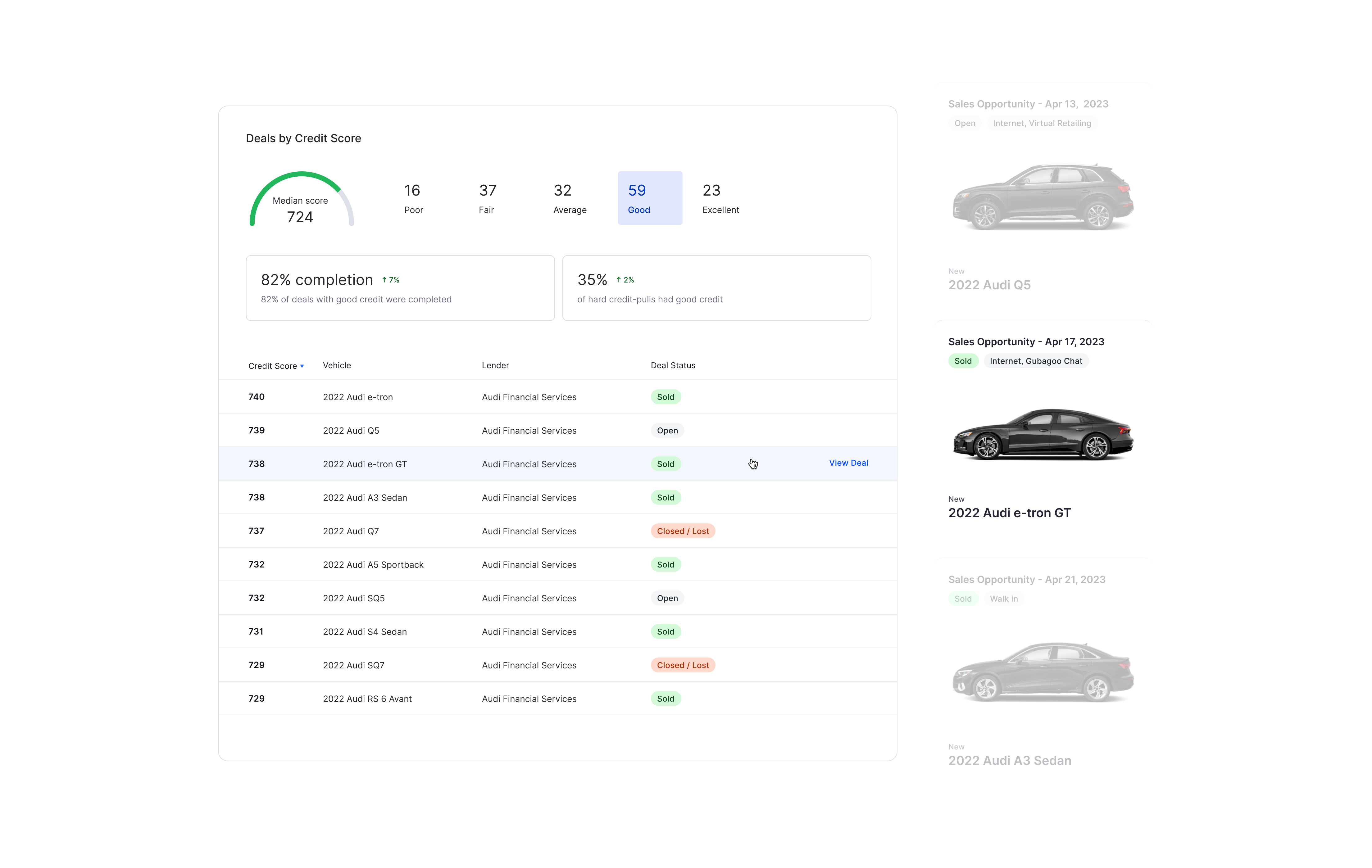
Connecting data to real customers
To help make numbers more tangible, I added the ability to drill down into actual deals and clients so users could go from dashboard to a table of deals quickly. This would help users make a direct connection between the numbers and what was actually happening at their dealership.
User testing
We tested our new architecture and formatting with a few dealers, giving them access to prototypes and talking with them as they tried it out. We had largely positive feedback and some comments about refining labeling and adding more in-depth details via tables.
Results & Impact
Phase 1 of Dashboard was rolled out in late 2021, resulting in a 53% increase in feature adoption vs the old dashboard.
Our CSM team (who use dashboard to conduct dealer performance reviews for our customers) had overwhelmingly positive feedback, and are saving time on tasks that previously required manual calculation.
“This is gonna make performance reviews a breeze” -CSM
“You guys are over the top…love how you displayed everything” -Dealer
“Shoutout to Nick for being a champion with Dashboard 2.0. This is an initiative of tremendous value to the business and our customers…Nick has brought creativity, out-of-the-box thinking, and user-focused mindset in a complete redesign of the GLive dashboard.” -PM
We are continuing to iterate and improve dashboard by adding new features such as sales data and calculating real dollar values by integrating with DMS services.