Hunter Vision booking experience
How we reduced Hunter Vision's call-team workload and increased online-bookings by 71.4%
Background
Hunter Vision is an Orlando-based vision correction practice that helps patients achieve their best vision through LASIK and other corrective procedures. To book an appointment, prospective clients either use the form on their website, or call.

About my role
As the sole designer in a tight-knit agency, I was challenged with leading research, UX/UI, and front-end development for this project. I collaborated with my colleagues, James, who built the back-end and front-end scripting, and Wil, who provided us with data and analytics.
Task from stakeholders
My team was tasked with redesigning the Hunter Vision booking app—our stakeholders were seeking higher online booking volume. They also wanted the app to sync data with their electronic health record system (EHR), so their call-team wouldn't have to manually enter the data before appointments.
Research and insights
First, I needed to get some background on the current patient experience. I had some ideas for improvements, but needed to get a more complete picture of the patient booking experience.
Interviews - Through interviewing surgery counselors and the call team, I uncovered some insights:
- Patients often weren't sure which type of appointment they should sign up for and needed guidance.
The current solution required a selection from a few technically-worded appointment types, leaving users to decide which one they wanted, sometimes calling in to make an appointment instead. - Patients would call in to reschedule appointments, taking the busy surgery counselors away from more meaningful conversations with patients.
I saw this as an easy win for our call team if we could enable patients to reschedule appointments on their own.
Understanding the visually impaired experience
At the time of this project, I wore glasses, so I took a look at the existing booking solution with my glasses off to get a sense of what the experience is "visually impaired", considering that most of our clients come to us specifically because of this problem. I noticed that the form was in such a small font, that it was irritating to complete, even with my mild prescription.
I asked a few of my coworkers and friends who wore glasses to tell me what they were thinking while completing the booking flow. The most common frustrations were that the font seemed small, the font was too low-contrast, and some labels were confusing.
Problem
- Patients (primary)
People with vision impairment are frustrated by filling out poorly-accessible forms because of small text, low contrast, and questions they don't have enough context to answer. - Call team (secondary)
Hunter Vision's call team frequently has to assist patients with booking and rescheduling their appointments, taking time away from their more meaningful patient interactions.
Process
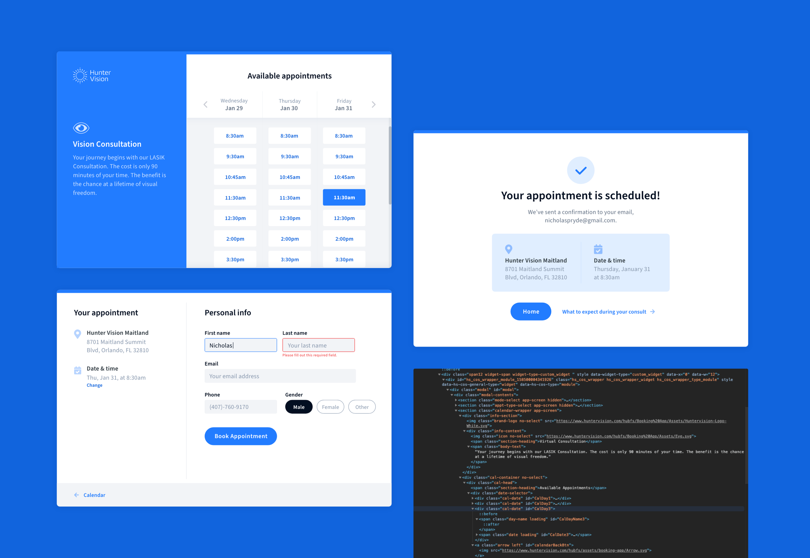
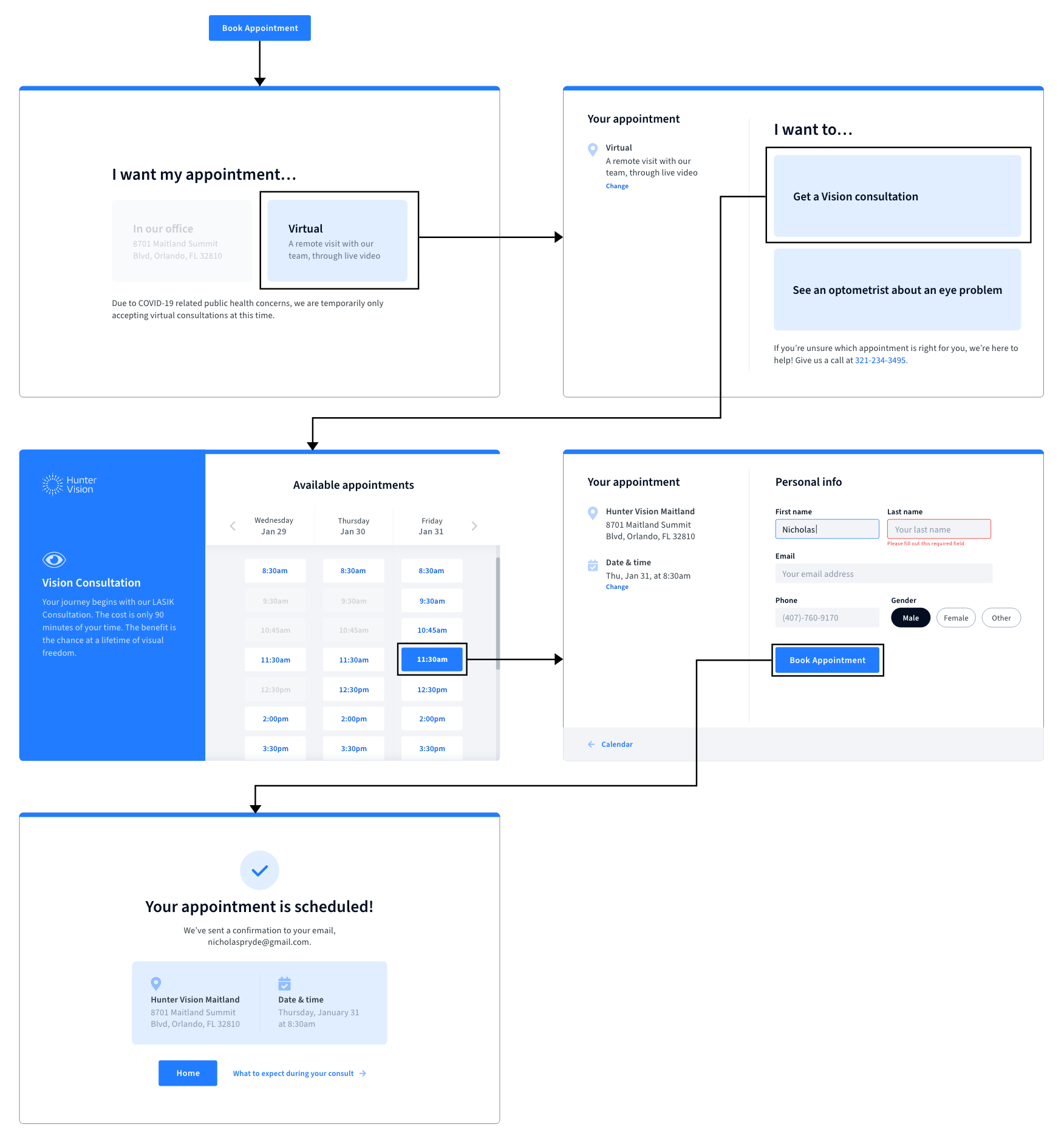
I started by sketching out a user-flow for the new booking process.
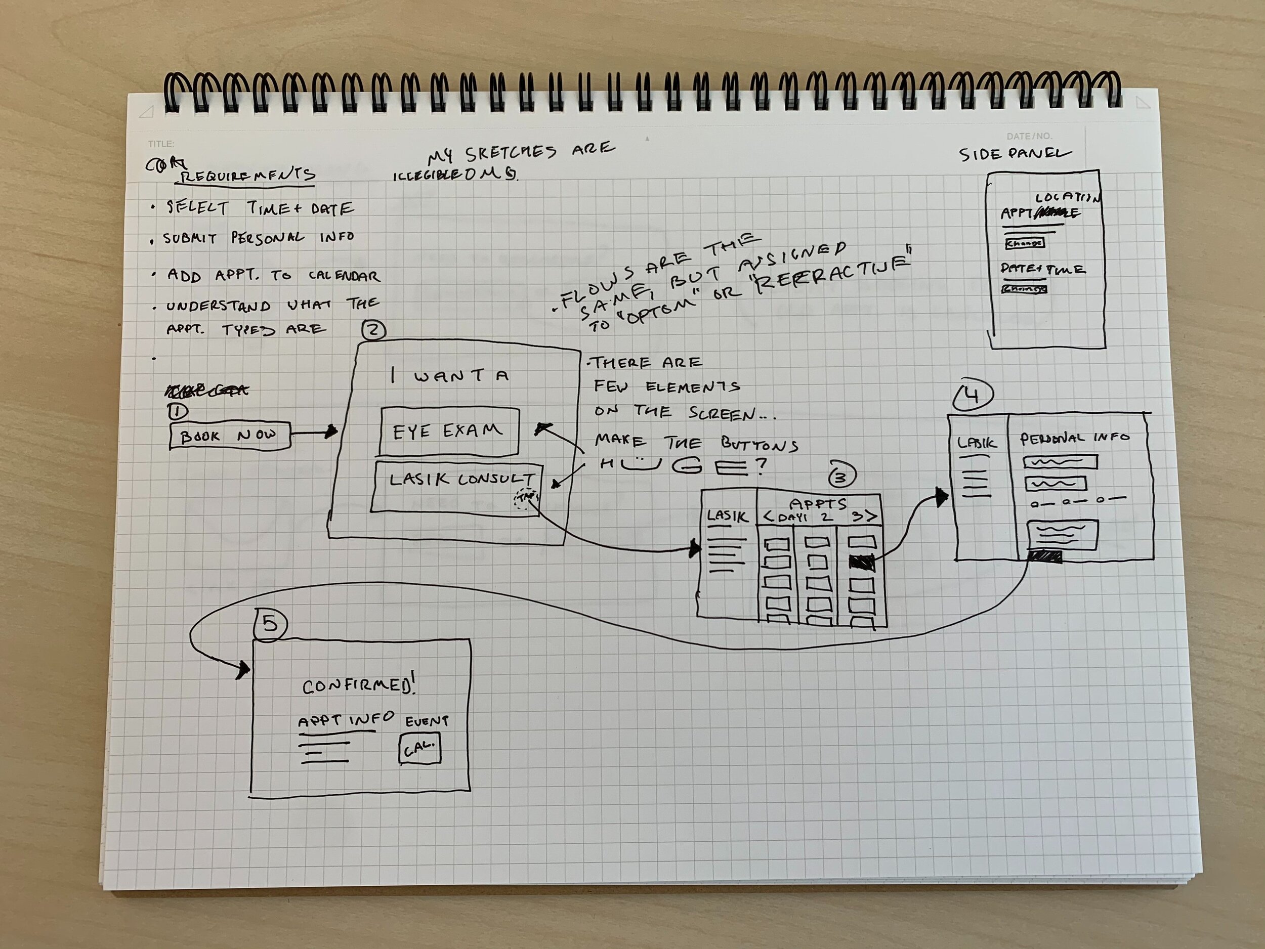
One challenge we ran into was how to present the calendar and time selection. Initially I designed the calendar showing the full month; however, because our EHR could only load 3 days at a time with an acceptable load-time, we had to modify the format. Here's the format I landed on.
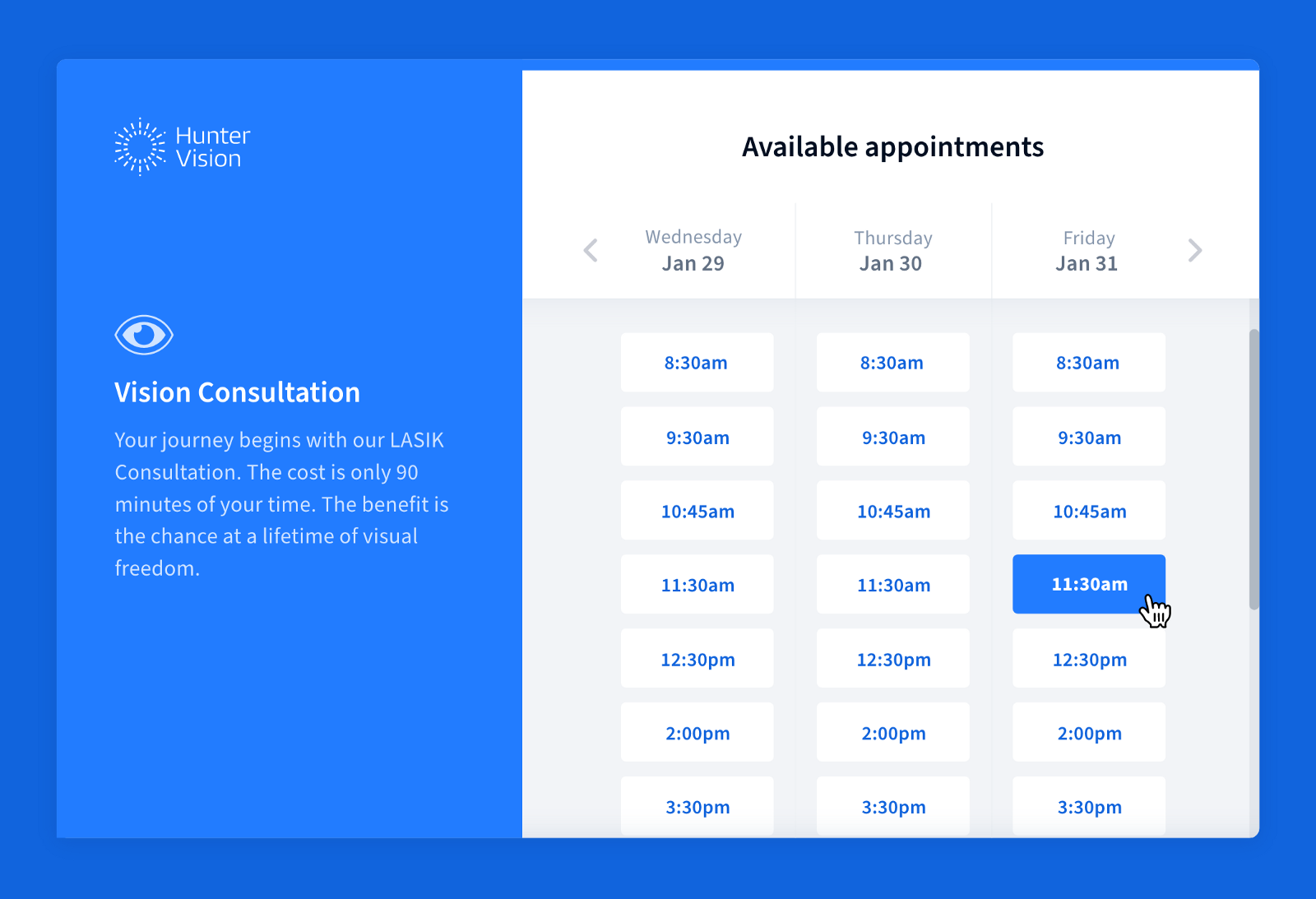
Creating a scalable UI kit
I created a set of UI standards for the mini-app, primarily based on the planned future state of the Hunter Vision site (separate project). Working from this kit made development smooth, and allowed us to add on to the app quickly.
User testing and iteration
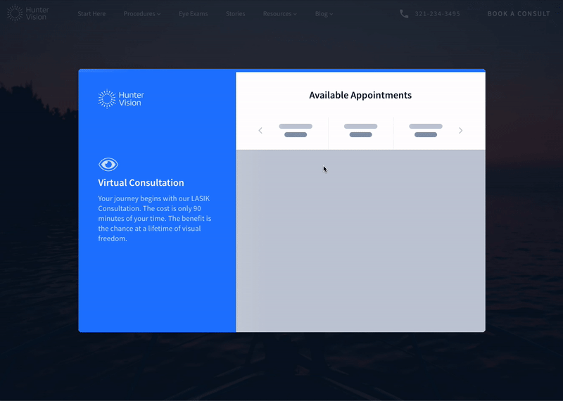
During testing, people were unsure what was happening when they moved the calendar to a new set of days. There was a delay of up to 3 seconds that left users without system-feedback, leading to extra presses on the day arrow and skipping beyond their desired date.
My solution to this was to add a loading state with an animated gradient to give users feedback that the system was loading the next set of days.
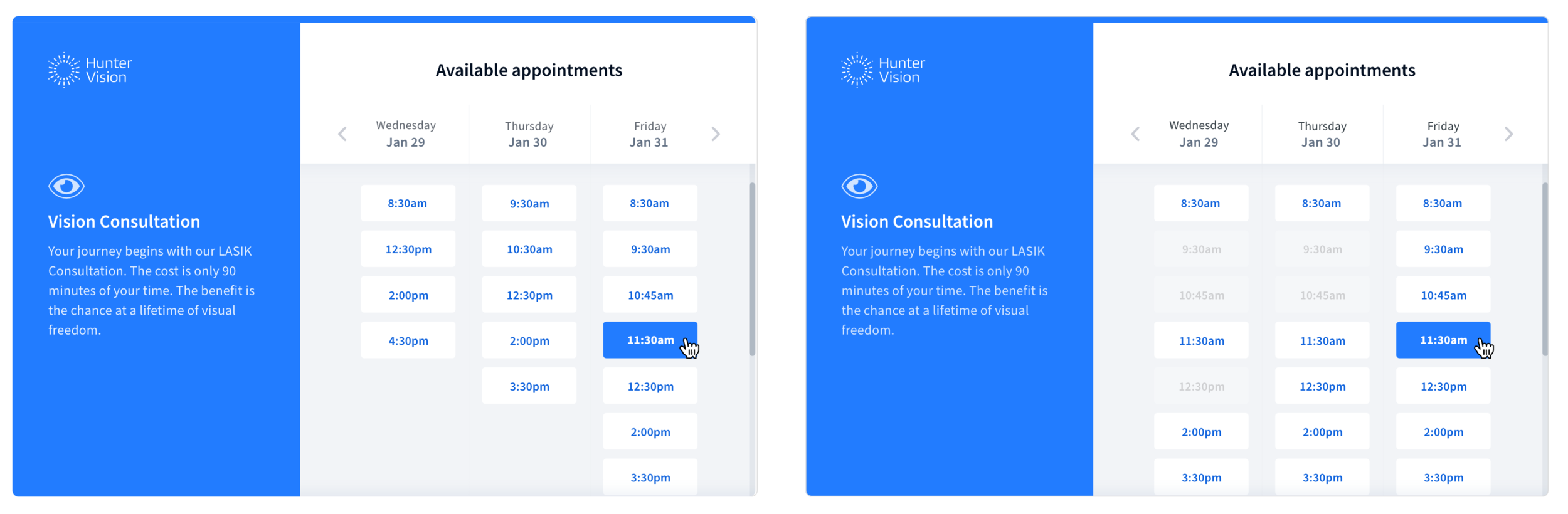
I also received comments that some text was hard to read due to low contrast, so we increased the contrast on all body text.
Another comment we received was confusion as to why certain times weren't visible for certain days. Users were uncertain of Hunter Vision's schedule because "taken" times were hidden.
Our response to this was to show "reserved" times on the calendar, but in a disabled state, so users could better create a mental model of the schedule even when many times were reserved.
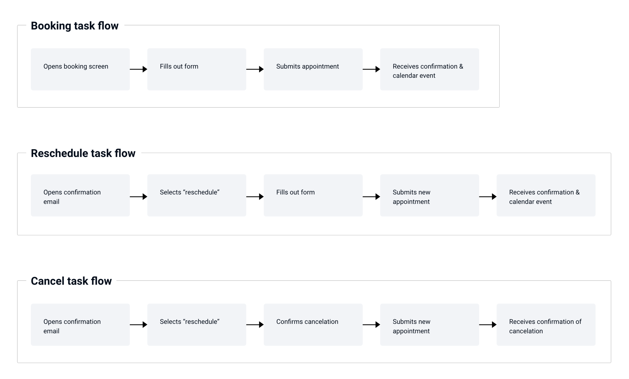
Final flow
Video walkthrough
I gave the team a video onboarding/walkthrough of the new app to make sure we all had a shared understanding of the patient experience.
Results & Impact
We observed a spike in online consultations shortly after the launch. Compared with the month prior, our redesign produced 71.4% more online bookings per month, with both months having nearly identical traffic volume on booking pages.
